Category Archives: branding

Logo evolutions

I enjoyed this brief, visual survey of global brand logos. It’s fun to see both what has changed radically and what has merely evolved, sometimes subtly, over the decades. The biggest changes in logo design in these examples are driven by shifts in the business or in its context. In that sense branding cuts both ways: brand designs do lead and they do follow trends.

Corporate brands are much more than the corporate name, even as wordmarks remain crucial for many brands and are likely more important the more local a business is. In any case, you will see several logos in that list that have become powerful enough to omit their company names entirely. Few do so because the image is the name, as is the case for Apple or Shell. With others you might wonder about the thinking or the research that led that decision.

Anti-marketing? Real estate issues in Bolivia

To North-American eyes this was a thoroughly surprising message:

“Esta casa NO está en vente” (This house is not for sale.)

Anti-marketing? Why write that on a building?

Turns out the anti-message is rooted in changes taking place in Bolivia under the government of Evo Morales, the country’s first indigenous president, even though the majority of Bolivians are indigenous.

Speaking with some of the property-owning locals we learned that it has become increasingly difficult to maintain ownership of anything other than the house they live in. It appears it has become relatively easy for squatters to gain title to unoccupied properties. One person we spoke with, told us they were paying someone to live in a second house they own, in order to protect their ownership. Yes, you read that right. They are paying someone so when they want to use the house in another way in the future they are able to because it is still theirs.

This also explains some of the other unusual notes scrawled in large letters in properties that weren’t in use, such as land without buildings. That message was usually something like “This property belongs to [insert name] and it is not for sale. [phone number]”

This was a good reminder to never assume that our own economic, social or cultural context is some kind of gold standard for how things “should” be and what we expect of others.

This restaurant logo works

Many restaurants take a less than stellar approach to branding. From so-so logos to hard to understand web sites using way too much Flash to the super cool interior design overpowering what the kitchen actually delivers.

This restaurant does a great job putting it all together. Ceviche is a dish – raw fish to be clear – that comes in many forms and is very popular in various South American cuisines. Hot peppers are a feature of many ceviche dishes. The Peruvian version is particularly famous in part because the Japanese-Peruvian fusion cuisine has been making an international name for itself.

The logo expresses this core offer without any ambiguity and the typography and application are both fun and slightly out of the ordinary.

This restaurant is one of many we have seen that offer awesome Japanese-Peruvian dishes. The commonalities between the two styles of cooking centre on raw fish and the many artful and save ways to prepare it. I never had sushi that was as delicious as this. The service was great, the night was lovely and we sat outside ’til late.

Causa peruana sampler
Warm and cold rolls. Delicious fusion.

A Concept Restaurant

Palermo district in Buenos Aires.

When recessions or economic downturns hit, restaurant owners can turn to creative solutions to survive in such a tough-at-the-best-of-times industry. (You might remember some of this appearing in North America, too.)

I thought this pitch on the sandwich board that otherwise might tell me what the specials of the day are was well done:

“We give you food, drink and good service …  You pay what you want, without pressure and prejudice… enjoy yourself.”

The restaurant looked like a very fine choice for a great dinner out. It also looked like this was no longer a gimmick to keep people coming but an actual business model a la 2011.

Election advertising in Argentina

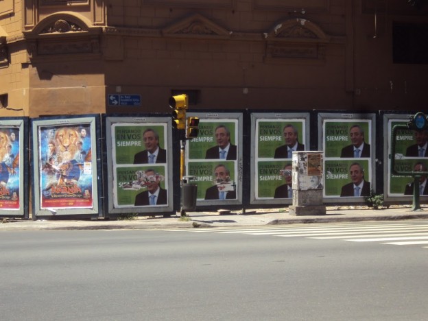
I saw this poster wall in Buenos Aires, Argentina in January. The current president, Cristina Fernandez de Kirchner, followed her husband into the presidential role when he could not run again due to the country’s constitutional limit. He would have been eligible to run again after being out of office for one term (in contrast to the US system, for instance), had he not died in the fall of 2010.

Here the competitive positioning the opposition has chosen is “Thinking always about you” and the candidate’s signature. Now, granted I do not keep up much with daily political life in Argentina. But I am intrigued by the implication of this competitive positioning. It is a thoroughly positive line with thoroughly negative implications, thus, possibly portraying a real choice without the personal attacks designed to confuse and obfuscate that have become the mainstay of US and Canadian electioneering.

As an aside, love the light blue tie on white shirt – so easy to wear the Argentine flag and show a bit  of patriotism.

Pensando en vos siempre. Buenos Aires, Argentina. Palermo district.

Global brand in local market

Palermo district, Buenos Aires

Can you see it?

Yes, it’s on the municipal street sign. Click on the photo and enlarge it. There it is! Ah, that’s ubiquitous advertising.

Claro and Nokia. Claro is a telecomm company, while Nokia continues to be the number 1 mobile phone maker in the world.

Does your city use street signs for corporate brand awareness? This was everywhere in BA.

By the way Claro’s tagline is “Es simple. Es claro.” Which is a fun play on words. (“Simple” doesn’t mean exactly the same as “simple” in English, but is used more in the sense of “plain, simple-minded”, even though here I think “simple” does translate well, while “claro” stands for “OK” or “yes” as well as “clear” or “clearly”) Not sure what it does for brand equity that “claro” is one of the words we heard most often when people wanted to express agreement with something – That’s got to be good for this rather large Telecom operating in various countries in South America.

Nokia uses its “Connecting People” tagline in Argentina in English as it does around the world. I guess “pueblo conectando” – or the German translation of “Menschen verbinden” didn’t pass muster with the global brand guardians.

Santa Claus in La Paz

There are many fun parts to travelling. One relevant in this space is how being in a different place changes how we see ads like the one below.

While visiting La Paz, the capital of Bolivia, this past November we came across this Coca-Cola ad using the famous Santa Claus and the wonderful line, “Together we make magic reality.”

There are so many interesting layers to this photo:

  • A Coca-Cola ad featuring Santa on a snowy, starry night backdrop the Southern hemisphere in November (that’s spring heading for summer)
  • Santa as spokesperson for Coca-Cola (who else does pull this off?)
  • That jolly big man drinking his Coca-Cola
  • The Santa image, it is said, has been shaped significantly by Coca-Cola advertising going back to1931
  • A Coca-Cola ad in Bolivia where Coca leaves are a large crop some destined for traditional uses and some for let’s call it “export”and that doesn’t even have anything to do with the Coca-Cola formula
  • The statue in the foreground is of Simon Bolivar, Liberator of Bolivia from colonial (Spanish) rule, August 6, 1825.